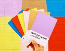
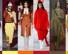
Every year, the world of high fashion eagerly awaits the moment when the authoritative guide to the most trendy shades - Pantone Fashion Color Trend Report - presents a palette that will set the color mood for the coming season. This is usually timed to coincide with fashion week in New York and London.
Despite the fact that this year the events were held online, the tradition was not broken. But why do famous couturiers rely on the opinion of this particular institution when creating new collections? Here it is worth saying a few words about the Institute itself.
Pantone is a consulting organization that forecasts the main color trends for the coming season. She is responsible for advising large companies on the influence of a palette of shades on brand development, the creation of goods, the use and implementation of fashionable tones in production as one of the main assets.
Why do big companies trust Pantone? Created in 1963, the Color Institute managed to make a real breakthrough in printing by developing a revolutionary tool - the PANTONE MATCHING SYSTEM®, which allows you to select and reproduce colors with 100% accuracy. The system is a recognized standard of shades, where each tone is assigned a unique number. It has found wide application and is used in many industries: cosmetics, clothing, architecture, interior design.
@Ocreative
It is thanks to the high accuracy of the Institute’s forecasts when creating a new collection that famous couturiers choose those shades that, in Pantone’s opinion, will be relevant in the coming year.
@Luxsure
Pantone trend colors 2021 - main palette
When predicting the fashion range of the coming season, the Institute’s specialists made allowances for the current situation. According to them, next year people will look for inspiration, consolation, and pure feelings. Therefore, the range is filled with shades that evoke associations with peace, tranquility, warm emotions, and freedom. After all, many, spending days in isolation, dreamed of a bright holiday, unforgettable travel, long walks, gatherings with friends and loved ones.
"Spring Summer"
In early September, Pantone, on the eve of New York Fashion Week, presented its current line, which included the ten most trendy tones of the coming season.
“The range for spring/summer this coming year is full of personality and successfully combines calm, ease with bursts of boundless fun and homeliness that charge you with strength and positivity,” said Pantone Color Institute Executive Director, Leatrice Eisman.
A list that inspires resourcefulness will not only be a fashionable statement, but will also be able to easily adapt to new, post-pandemic conditions:
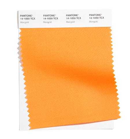
- Marigold. Described as a sunny tone that has a calming effect. Despite its brightness, which does not allow Marigold to be classified as a calm palette, it is still filled with a certain tenderness and comfort.

@pantone.com
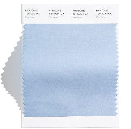
- Azure - Cerulean. A soft, delicate shade of a cloudless summer sky. Of the entire palette presented by the Institute, Cerulean is the calmest and most airy. With his presence he fills the surrounding world with joy and comfort.

@pantone.com
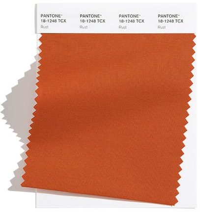
- Rust. Warm Rust, part of the earthy palette, brings a touch of contrast to the muted palette. Institute experts claim that Rust symbolizes fallen leaves. Thanks to its neutrality, it goes well with any shade, but especially well with smoky pink.

@pantone.com
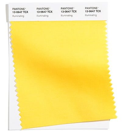
- Illuminating. Life-affirming solar Illuminating is as optimistic as a summer morning. This rich yellow is designed to bring a joyful smile.

@pantone.com
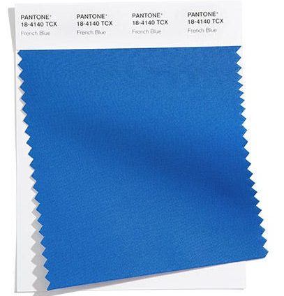
- French Blue - French Blue. The relaxed and practical tone seems to transport you to spring Paris, evoking pleasant memories of the French spring.

@pantone.com
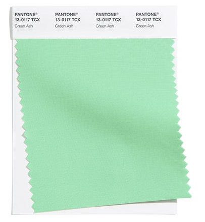
- Green ash – Green Ash. Infinitely gentle pastel Ash simultaneously pacifies and fills with vigor.

@pantone.com
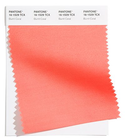
- Coral – Burnt Coral. Life-affirming, invitingly warm Burnt Coral attracts with positivity and evokes pleasant emotions.

@pantone.com
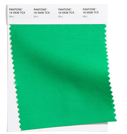
- Mint - Mint. Like the plant of the same name, it charges with energy, fills with vivacity, excellent mood, and brings joyful notes to dull everyday life.

@pantone.com
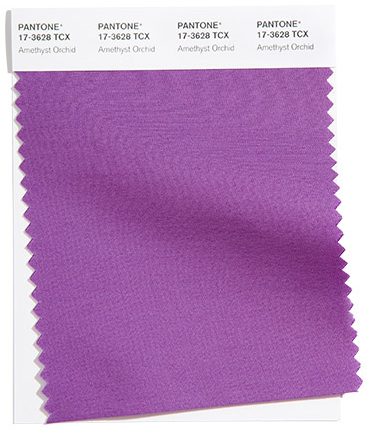
- Amethyst Orchid - Amethyst Orchid. A deep purple based on one of the most original plants. This is an unusual tone, filling with energy and adding a touch of extravagance.

@pantone.com
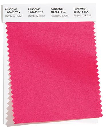
- Raspberry dessert - Raspberry Sorbet. One of the brightest shades of the new season. Seductive sorbet radiates energy and evokes admiration.

"Autumn winter"
According to Pantone representatives, the trendy range of the autumn-winter period reflects the relevance of traditionalism, emphasizing individuality.
“Possessing inner strength, the Fall/Winter 2021 shade list helps highlight uniqueness through creative visual expression,” said Leatrice Eiseman, executive director of the Pantone Color Institute.
The universal palette “out of fashion and time” is filled with practicality and at the same time allows you not to get lost in the crowd:
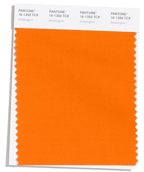
- Amber glow - Amber glow. Smoky orange motivates self-expression and increases confidence levels. Amber glow will be a juicy splash in a calm look, especially in combination with a blue outfit. It also harmonizes with green, brown and burgundy.

@pantone.com
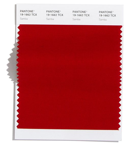
- Samba. The bold shade of red seems to immerse you in the atmosphere of a cheerful Brazilian carnival.

@pantone.com
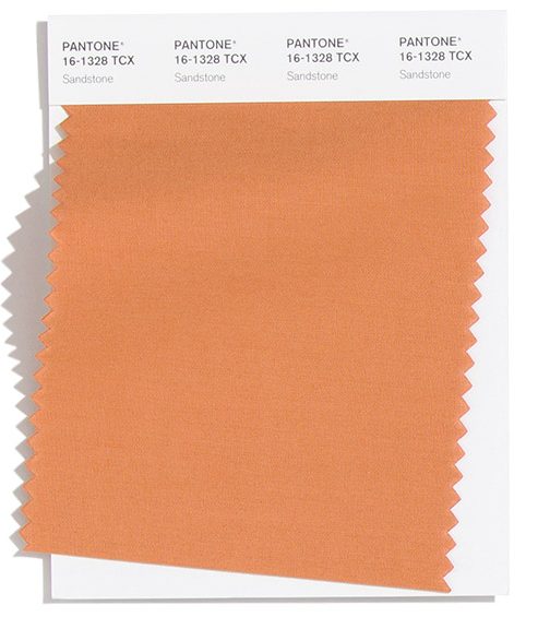
- Sand. The very warm, earthy sandstone resembles a freshly baked croissant. This is a neutral tone that will be suitable throughout the year. Sandstone looks equally luxurious both in a monochrome outfit and in combination with a bright or pastel palette.

@pantone.com
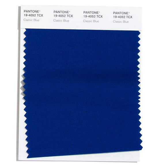
- Blue classic - Classic Blue. Juicy, like the delightful night sky, Classic Blue fascinates with its attractiveness and opens up a world of dreams coming true.

@pantone.com
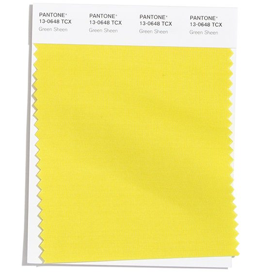
- Green Sheen. The bold and life-affirming yellow-green tone will allow you to stand out in any crowd. Of course, not everyone will dare to include such a rich tone in their wardrobe, but you can try diluting it with a pastel palette.

@pantone.com
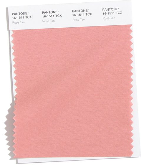
- Smoky pink - Rose Tan. The delicate shade immerses you in a world of serenity. Despite the tenderness, this is a fairly mature tone, so it is suitable for creating many stylish looks.

@pantone.com
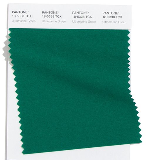
- Green ultramarine - Ultramarine Green. Juicy, giving a charge of vivacity fills with a feeling of self-confidence. A deeper version of blue-green will be appropriate when creating an image for all occasions.

@pantone.com
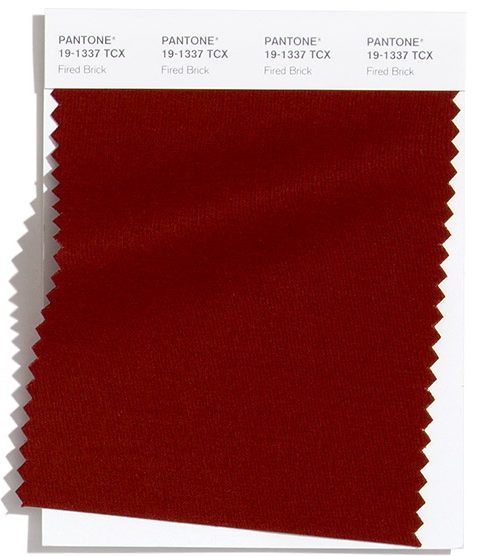
- Burnt brick - Fired Brick. Rich Fired Brick adds a sense of homeliness and security.

@pantone.com
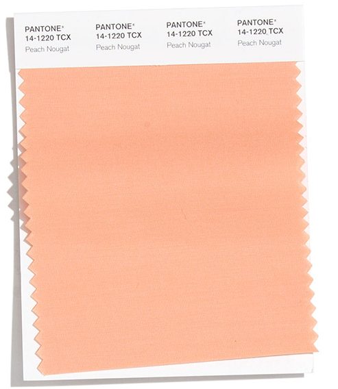
- Peach nougat - Peach Nougat. Warm Peach Nougat surrounds you with tenderness and warmth. This is a muted, feminine, mature, discreet tone.

@pantone.com
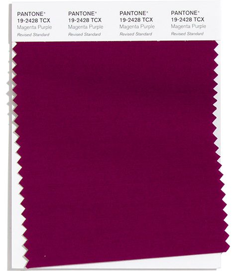
- Purple fuchsia – Magenta Purple. The bold color attracts and brings notes of mysterious gothic. This is a truly royal, luxurious shade that looks best in silk and velvet.
@pantone.com
Basic palette
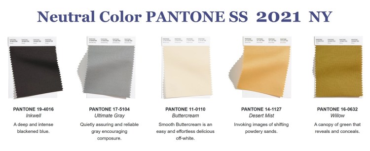
The 2021 range is filled with five tones (instead of the traditional four). The universal, timeless color set leaves plenty of room for imagination, allowing you to create a wide variety of looks:
- Inkwell - Inkwell. A rich tone that many perceive as black. It successfully acts as a bright frame for a more restrained palette.
- Ultimate Gray – absolutely gray. Confident, reliable, calm, motivating to self-affirmation.
- Buttercream. Appetizing, warm, homemade “Cream with Cream” brings a feeling of boundless comfort and peace.Unlike pure white, it is less pretentious and delicate.
- Desert Mist - desert fog. Evoking images of hot sandy waves, Desert Mist goes well with both pastel and more exotic palettes.
- Willow - Willow. An intriguing woody shade reminiscent of bark. It seems to envelop in mystery, “now hiding, now revealing the contents.”
@pantone.com
The colors of the coming year combine freedom, practicality, home comfort and a sense of adventurism, with which they will fill gray everyday life and emphasize the thirst for life and the desire for lightness.


 0
0